4 Ways To Make Your DIY Website Look Professionally Designed
How to Make Your DIY Site Look Professionally Designed
I dug this blog post up after over a year of it sitting on the shelf and I'm happy to say that this information is still extremely relevant and true. So many of us are DIY lifers and web design is no different. If you've taken on the brave task of building your own website, here's how to make it look its best!
[1] Choose Pictures That Make Sense To Your Brand
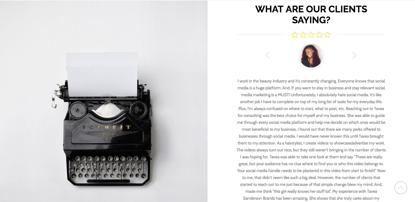
Choose images that go along with your brand's look and feel. This means your pictures should include a few of your colors and make sense. You probably don't want to choose a photo of a tattooed bodybuilder for your preschool website. Unless, you just happen to be a ripped, tatted preschool teacher — which is pretty cool. But generally, stay on brand or stay home. Make sure you use a high-quality pic like this image on my original homepage. I snagged it from Unsplash, a free stock photo website.
![]()
[2] Make It Easy To Read
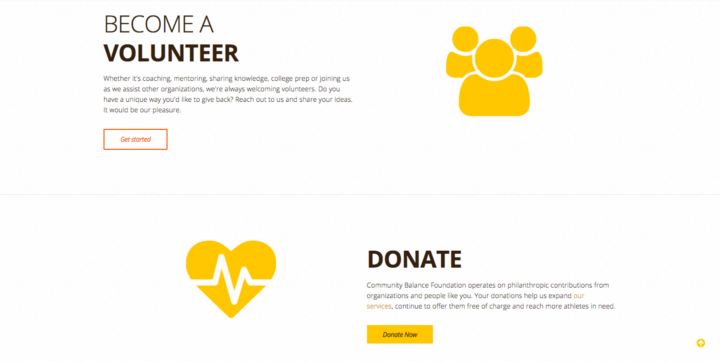
If you want people to read. Keep it simple. At the core of this step is to use a light background with dark text. This creates contrast. Check out the bold dark text I used on Community Balance Foundation's light textured background.
[3] Don't Smush All of Your Text into One Section
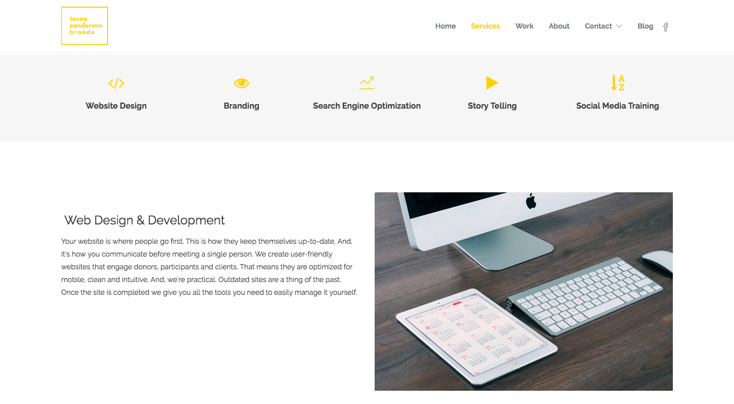
Leave space around your text. In the design field, we call it white space. Don't write too much. Only include what you really want the reader to know. Then, choose the amount of space you want around it. If that looks bad double it. For example, my original services page has 60 pixels above and below each text and image section and about 40 pixels on the left and right sides.
![]()
[4] Consistency
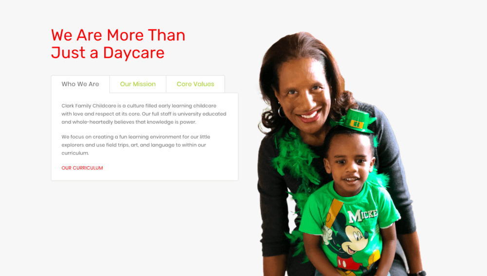
This leads me to my last point. Wash. Rinse. Repeat. Use the same amount of white space, colors, and image styles throught your entire site. This will help it to look professional and neat. I used about 7 colors on Clark Family Childcare's website and the consistancy helps it to feel profesional, even with a fun kiddie-focused design.
![]()
 Build Your Own Website Like The Boss That You Are
You got this. Start with these tried and true tips and you'll knock your first website out the park! If you don't know where to start check out this post I wrote about The First Two Steps to Starting A Professional Website or this one explaining How To Plan Your Website Flow.
Happy Designing!
Tavea
![]()
Related Posts
Meet The Author

Hi, I'm Tavea. A niche marketer, a wife, and mommy to two handsome little men. I traded my science degree for a life of art and creation. Now, I share how I make marketing simple and organized while juggling life's work. I talk about what's working now, trends to jump on and battling our fears as professionals.

