Your Website Will Be Trash If You Start Without This.
One of my first questions, when someone asks me to build a website for them, is: “Do you have a logo suite and branding yet?”. I usually get one of 3 answers. Some people have nothing, others have a logo and almost no one had branding (nor do they know what it is).
Branding is the look, feel, and voice of the business. It serves as a constant guideline for everything you create. This way everything is cohesive. Your website, your social, swag, everything. Without it, your web designer is just pulling things out of the air which makes the design process so long. If you want your website to look polished and professional start with branding first and then build.
Branding Is A Lot Simpler Than You Think
Many people are just starting up their brands, so as a minimum here’s where to start. Assuming you already have a logo, use the colors in the logo as the start of your color palette, then add a few complimentary colors. No logo, yet? Start with a mood board. This is the mood board I created when I was rebranding this website.
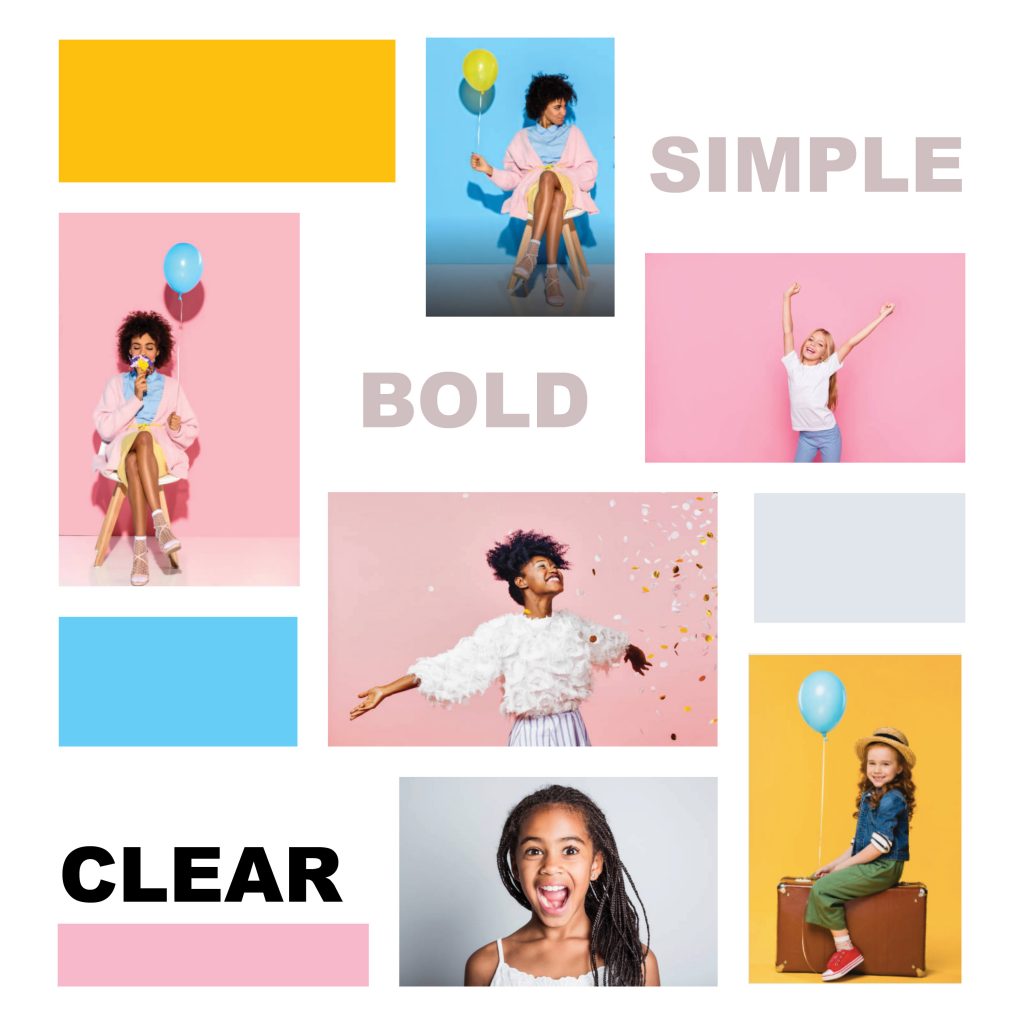
The mood board captures the “vibe” I was going for on the site. You can do this and send it to your designer. This is always the first step in my design process. So, I always guide clients through this. As a visual learner, mood boards help me to better understand what my client is looking for. When I understand, there’s less back and forth so the process is smooth and quick for everyone.
Related Post: 4 Ways To Make Your DIY Website Look Professionally Designed
You have a mood board. Now, what?
From here everyone’s on the same page. So, you’ll just want to pull the colors from the board, grab a similar font, and get some pictures taken that are similar to the aesthetic you’re going for. And, of course, design your logo.
Pro Tip: Create 3 color variations of your logo so you can use it anywhere. It’s the basis of a logo suite. Usually, a full-color, an all-black, and an all-white version is a good start. Then, ask your designer for the “non rasterized, non-vector native file”. (Just cut and paste what I wrote; she’ll know what you’re talking about.) Most designers create logos in Adobe Illustrator, so the file names should look like this “filename.ai”. You won’t be able to open it without the program but it’s perfect for sharing with your web designer and printer. They can update your logo and create larger files with ease. Trust me you want this.
Your final step is to think about the voice & feel.
To figure out the voice of your brand you need to consider your audience. Are you speaking to children, parents, athletes, professionals or newbies? There are so many audiences you can speak to and that directs the type of words you’ll use and the way you want them to feel.
I speak to entrepreneurs who are early in their careers and busy marketers looking to sharpen their efforts. So, I’m straight to the point and I try not to use jargon that I don’t define. My voice is casual and I’m a little cheeky because we all know that this life of “what’s the new hot thing” can be stressful.
Boom, A Brand.
If you hit these areas, you have a brand. There are other aspects you can add and it’ll likely morph as the business grows. BUT, issa brand, sis. Here’s an example of these pieces put together on a brand board for the logo refresh I did for my good friend and New York Stylist, Carlos Ortiz’s salon Mane & Bristle. A brand board is a compiled visual of your brand that you, your employees, and vendors can use as a reference for cohesion.

Don’t Skimp Out On Branding
I hope you’re convinced that exiting the design process with all of your hair and a beautiful website that converts visitors into customers is dependent on a solid brand. So, don’t build a confusing website. Create a brand first.
Here’s a free list of tools to help you get started. If there’s anything else you want me to clear up about websites and branding, drop a question in the comments? And, if you have any tips you want to add to the conversation, please share!
Happy Designing!
Tavea
Tags In
Related Posts
Meet The Author

Hi, I'm Tavea. A niche marketer, a wife, and mommy to two handsome little men. I traded my science degree for a life of art and creation. Now, I share how I make marketing simple and organized while juggling life's work. I talk about what's working now, trends to jump on and battling our fears as professionals.
